
I think the art of basic lands is an underappreciated part of Magic, but even more so in Commander, where they often get pushed aside by other more flashy lands. That’s why I’ve been so happy to block off time in tandem with Donny Caltrider to highlight the art of the basic lands over the last year—here are my previous picks for Plains, Islands, Swamps, and Mountains. Today, we have reached the end of the line for the foreseeable future as we cover the basic Forest and inevitably turn our attention to a new theme in the months so come. (Be sure to check out Donny’s picks as well.)
I didn’t respect the beauty of the basic land until I stumbled across the Better Basic series by James Arnold on CoolStuffInc. While I had always been a fan of the art of Magic, for the first decade of playing the game I only ever thought about the game’s art in terms of how reprints could be a gateway to different interpretations of the same idea and be an extension of my deck’s aesthetic. As time has gone on, I’ve made a habit out of starting each deck construction by finding the one piece of art I think fits best for each basic. I use that one piece whenever possible to help cement the visual themes of my deck. It might sound crazy, but there’s something very appealing about the lands in your Silvos, Rogue Elemental lining the bottom of your playmat as a pseudo landscape. I’ve held myself to no restrictions compiling today’s list, and sought to capture the lands that I think set the stage for my decks best.
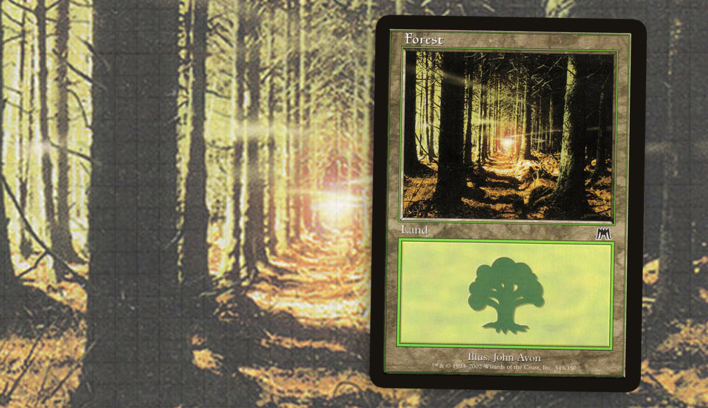
Onslaught—John Avon
I tend to start at my humble beginnings when discussing these lists, and today’s installment is no different. The first ten years of the game were populated by iconic pieces from Christopher Rush or Douglas Shuler. Yet, before I had any idea who John Avon was, I loved his art. When I’m building a deck in the old frame, such as Kamahl, Fist of Krosa or Seton, Krosan Protector, I find myself wanting to express an aesthetic more in keeping with a real world feel. Of all my options, this piece has stood the test of time very well.

Obviously it’s never going to entirely outclass some of the beautiful pieces of artwork we see today—John’s different interpretations alone form a gallery of excellence—yet, this piece sets a tone of mystery and quiet beauty that defined what I would come to expect of a basic Forest.
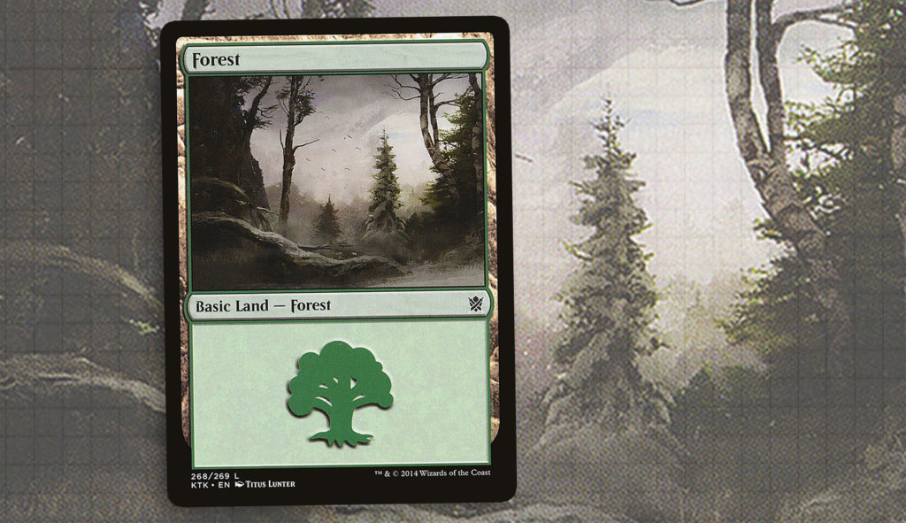
Khans of Tarkir—Titus Lunter
Trying to decide on which Forests I wanted to include on this list was not an easy task. Some of that comes down to the fact that a forest is something observable in our own world, which can be tied to our own sense memories. As someone from the midwest, I’ve seen a mountain and I’ve gone on a vacation to tropical islands, yet Titus Lunter’s basic Forest in Khans of Tarkir evokes a Minnesota lifestyle that I’ve experienced dozens of times. Obviously, we don’t have as many giant behemoths or ainok running around northern Minnesota, but Titus has captured this quiet moment of wilderness and a gentle expression of snow.
I’ve grown to appreciate Titus’s work over the last few years, be it lands like Frontier Bivouac or regal pieces like Throne of the God-Pharaoh. Whereas Magic has grown to be more ornate, employing finely detailed brush strokes and a sense of realism; here trees are just made out of a brush strokes forming the idea of a tree, creating a piece that feels unkempt and organic.
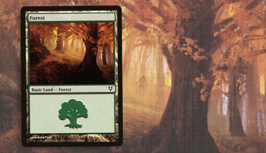
Avacyn Restored—Jung Park
While it’s easy to associate my home state exclusively with snow, we experience some beautiful Falls. The amber colors that encompass this piece speak to me and remind me of one of my favorite parts of the year—another thing I experienced on a daily basis. For a long time, my Yasova Dragonclaw Wolves deck used the last piece by Titus Lunter, because of how the wintery landscape felt like a proper representation of the visual style I was looking for. But as I began to tailor the look of the deck to the wolves within the deck, I found myself replacing my basics with Mountains, Islands, and Forests that were more grounded in their scenery. It makes this deck have the right character now, and the forests capture this true to life feel that I really love.
From the Vault: Realms—Brad Rigney
I am, by my own admission, not a fan of foils. It comes down to the fact that I want my entire deck to have the same look and feel, which a foil does not facilitate amongst 99 other cards. My one exception is this piece by Brad Rigney, which I would love to one day see in non-foil, as it is so captivating. There’s a bit of a fairy tale feel of the couple in the background, sharing a moment of embrace. The simple composition and colors have always impressed me, and I always look to fit this into any deck I can.
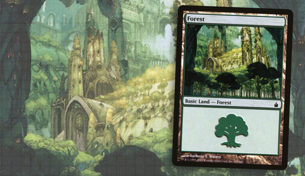
Ravnica: City of Guilds—Anthony S. Waters
One thing I have always appreciated about our trips to Ravnica is how they have helped to redefine what each of the basic lands look like. The economical use of nature and structures not only paints a picture of how Ravnica is different from other planes, but also shows the audience the social structure of the plane. Here even the commune of nature lovers has a towering structure, asserting Selesnya’s influence and importance.
A recurring theme in nearly every installment of this series is just how important going to Ravnica was. For those who started in the years following the first visit, you may not realize just how rigidly basic lands were rendered in years leading up to it. Ravnica as a metropolitan world from one edge to the other created a plane that seemingly had no place for nature. Yet Wizards met that challenge and freed themselves so that the depictions of basic lands going forward could be that more striking.
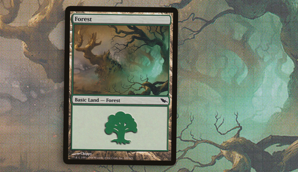
Shadowmoor—Chippy
There is a shared experience among Magic players where you can go years without knowing about the existence of a card. This piece of art is something ghastly and alluring that I was completely unaware of for a solid eight years after it saw print in Shadowmoor. It should be no surprise though; Chippy doesn’t do lands very often, leading to them feeling very different. I find that I have used this the most for The Mimeoplasm, but I would be lying if I said that I didn’t want to try to find more chances to use it.
Unlike all the other pieces I’ve talked about today, this piece lacks so much of what really defines a Forest in the general sense. There’s not a lot of life in these trees, just gloom. Even the lighting is unnaturally coming from below and has this off-putting sense; it lacks the hues of natural light we are accustomed to. And while it’s not a detail I’ve monitored closely in preparation for this series, it might be the only basic Forest that depicts creatures that are not of our world. Either way, this dark and twisted basic is one of my favorites and I’m happy to alert others to its existence.
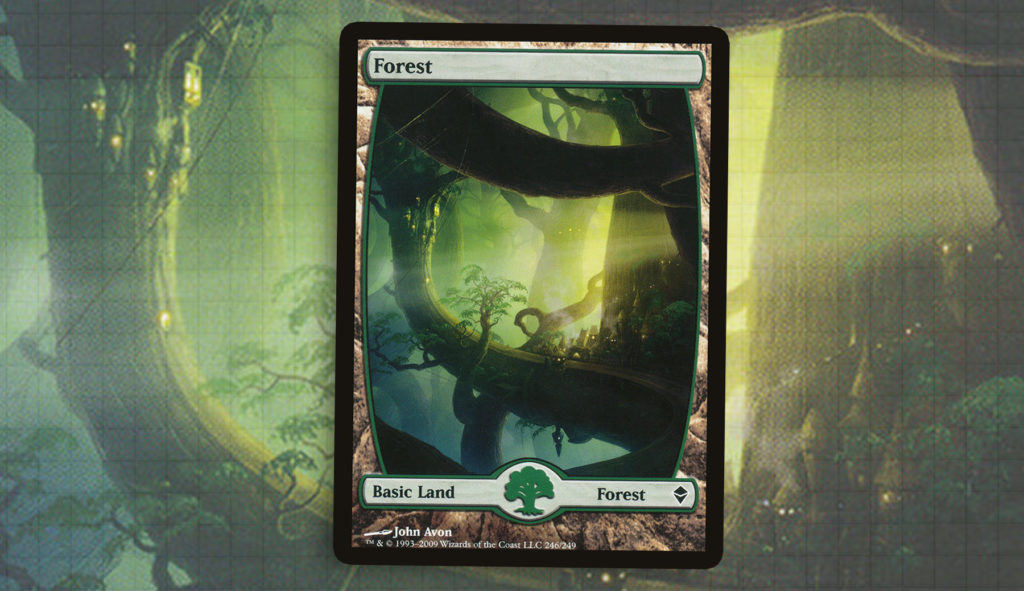
Zendikar—John Avon
Finally, I wanted to end right back where we began, with John Avon. When I returned to Magic by drafting Magic 2010 and into Zendikar, one of my biggest realizations was just how far the art had come in the two years I had been away from the game. I remember drafting Unhinged one night in college and not really seeing the appeal of the full art basics in the set. But when I cracked a Zendikar booster pack, I marveled at the impact these landscapes alone made. It’s no wonder that Zendikar reignited something in me.
Some of my favorite forests have been bright and quiet, while others have brought a dark and looming sense. But there is something so grandiose about this piece that has stuck with me over the years. I think it’s the scale of the society that lives on these gigantic branches and the beauty of the light coming in and really selling why a civilization would call a lumbering branch home. Similarly to how Ravnica had redefined what the basic lands look like in an urban setting, Zendikar redefined the scale and grandeur of these landscapes.
I have really loved diving into this series, especially as an exercise to break up the week to week Commander talk. I think players look past the art on the cards, obviously there is an entire subsection of the community that adores the art, but I believe there is not enough crossing over to really draw both sides in. Once you become really invested in a Commander deck, I would advise taking a look at your lands and really working to have them become an extension of your theme as much as any other card. It’s weird to be done with this series, though I know we’ll find something else to muse about in the near future. Thanks for coming along on this journey with us.
Ryan Sainio is a Graphic Designer who writes about EDH and the EDH community. He has been playing Magic: The Gathering since 7th Edition in 2002 and values flavorful and fun gameplay over competitively optimized decks.